Indhu
Product Designer
based in Seattle
Contents
01LATShipped
02KeyeShipped
03Misinformation Center
AboutEmailLinkedIn

LAT

Lifecycle Assessment Tracker — Turning fragmented campus maintenance into a trusted financial decision system

LAT Hero
Context
Lead designer for an ML-driven platform helping a university manage 60–80+ buildings across three campuses — layered onto their existing tools, not replacing them.
Constraint
The legacy CMMS/ERP stack couldn't be disrupted, data integrity had hard boundaries from duplicated records, and capital decisions were politically sensitive.
Decision
Shipped as a modular API layer with human-in-the-loop AI — approval gates, visible reasoning, logged overrides — instead of full automation.
Tradeoff
Chose slower, trust-building decisions over speed; a wrong high-visibility alert (the boiler incident) validated staying cautious.

TL;DR

Role
Lead Product Designer (60% design, 40% strategy)
Team
1 PM, 1 designer (me), 2 external engineers, client stakeholders
Timeline
12 months (Jun 2023–May 2024)
Impact
95% pilot adoption | 70%→95% data accuracy | 25% cost reduction projected
Key Skills
Enterprise UX · ML/AI design · Stakeholder alignment · Field research · API-first architecture

01 — Snapshot

Product
An ML-driven platform helping a Pacific Northwest university manage 60–80+ buildings across three campuses. LAT shipped as a modular API layer alongside their legacy CMMS/ERP, turning fragmented data into financial intelligence without a system replacement.

My role. I owned product vision, workflows, and the design system, aligning field technicians, managers, accountants, and executives — translating institutional needs into requirements and pushing for field research when stakeholders wanted to skip it.

Timeline ran June 2023 to May 2024, 12 months
Discovery to data consolidation to ML framework to pilot to beta to release. The platform continued beyond my tenure.

Team
1 PM, 1 designer (me), 2 external engineers, plus client-side CAPEX, data science, accounting, and property management teams

Hero — role-based dashboard split: the same asset rendered for a technician (mobile, offline-first), a manager (priority queue), and an executive (filtered summary). One data model, three cognitive surfaces.

Impact

95%
Pilot adoption among property managers, vs. the 70% threshold UW's IT training team uses to decide whether a tool stays live
70% → 95%
Data accuracy, audit of asset records pre/post canonical ID + sync validation
~20 → ~8 min
Reporting time per ticket, observed field timing pre/post offline-first workflow
−36%
Budget revisions, planning-cycle comparison vs. prior year
−12%
Emergency repair incidents, work-order classification during pilot
−60%
Planning time, capital planning cycle comparison vs. prior year
−25% projected
Unexpected maintenance costs, lifecycle model forecast vs. pilot repair data

Adoption, data accuracy, and reporting time are the numbers I'm most confident in because they were directly observed. The cost figures came from the platform's own forecasting layer, so I hold them more loosely and say so when asked.

02 — Context & Problem

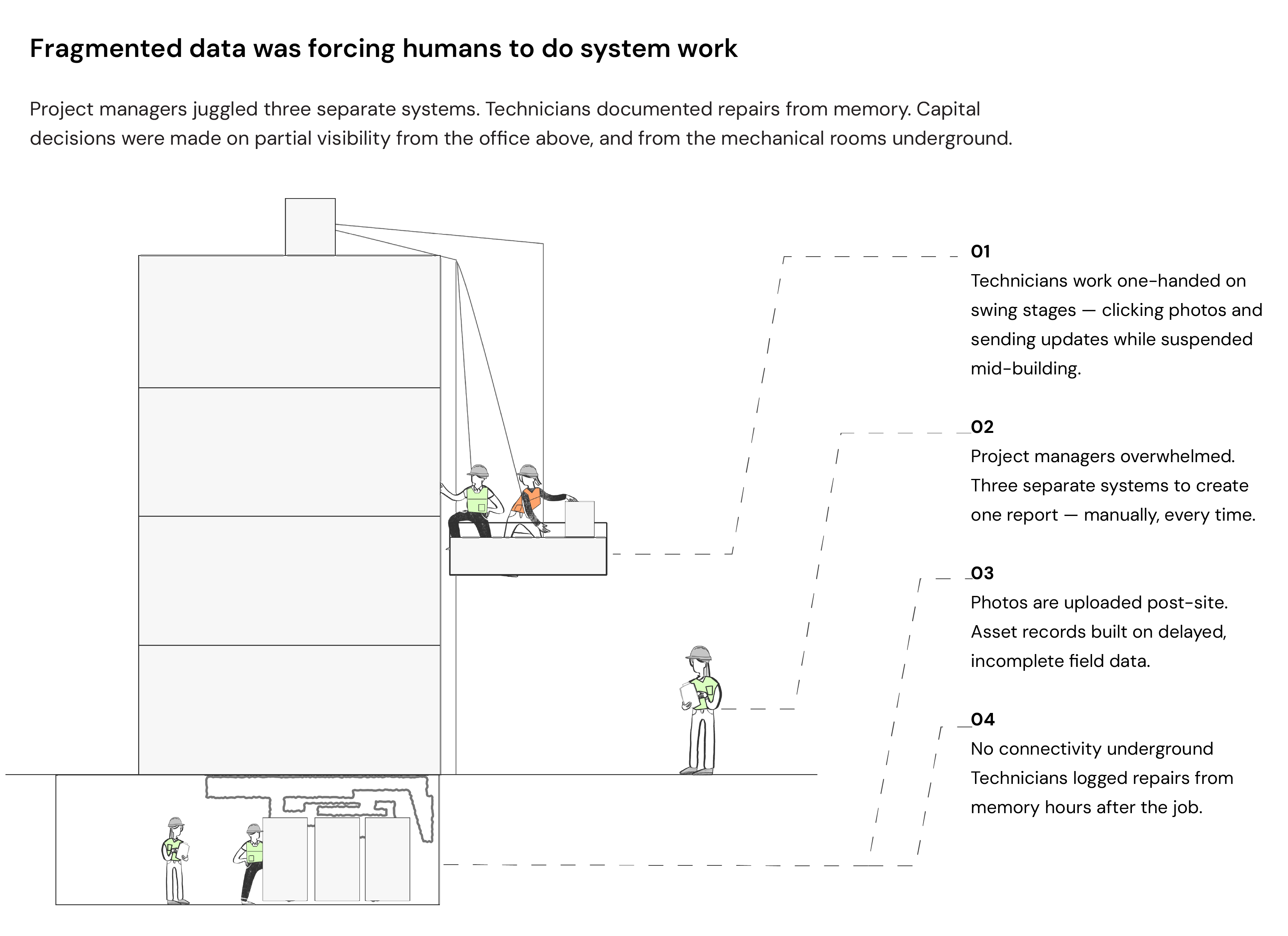
Fragmented data was forcing humans to do the work a system should have done

What this shows: about 70 to 75% of operational U.S. buildings predate 2000 and were never designed for lifecycle management (EIA.gov). Property management vendors price for more of the same. Pay more and you get a bigger bundle of the same single use tool, still built for offices only or residential only. Nobody sells the integrated version for a mixed use portfolio like a university's, with labs, offices, and housing converted from other uses. That product doesn't exist at any price. Fragmented systems just produce fragmented data, no matter how much you spend.

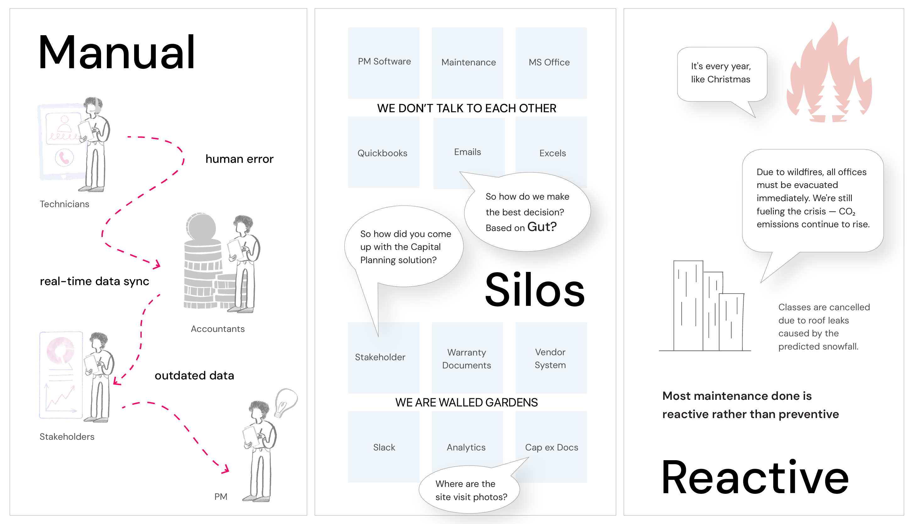
Universities manage billions in infrastructure with fragmented tools: a technician underground can't access repair history, a project manager stitches together spreadsheets and invoices before planning meetings, leadership decides on partial data.

Without a unified system, everyone operates in their own flow with no common path.
User Issues

"I do the physical work in 30 minutes, but reporting takes another 20."

"Each year I'm choosing between urgent-now and smart-long-term with partial data."

Research base: 7–8 full-time technicians and vendors (including swing-stage shadowing), 4 operations/construction project managers, 2 accountants, 5–6 executives, and the Director of Facilities — UW Seattle's primary sponsor for the engagement, with a later proposal to extend to UW Tacoma.

The institution wasn't lacking expertise. It was operating without a unified source of truth.

Why existing tools failed

CMMS platforms handle tickets and leases but don't model asset lifespan or CapEx tradeoffs. Preventive maintenance ran on time, not risk, causing over-maintenance and surprise failures. Field tools assumed stable connectivity, so slow digital reporting killed adoption. And replacing the legacy stack wasn't viable — it was wired into procurement and budgeting. They didn't need another silo; they needed a layer that worked with what existed.
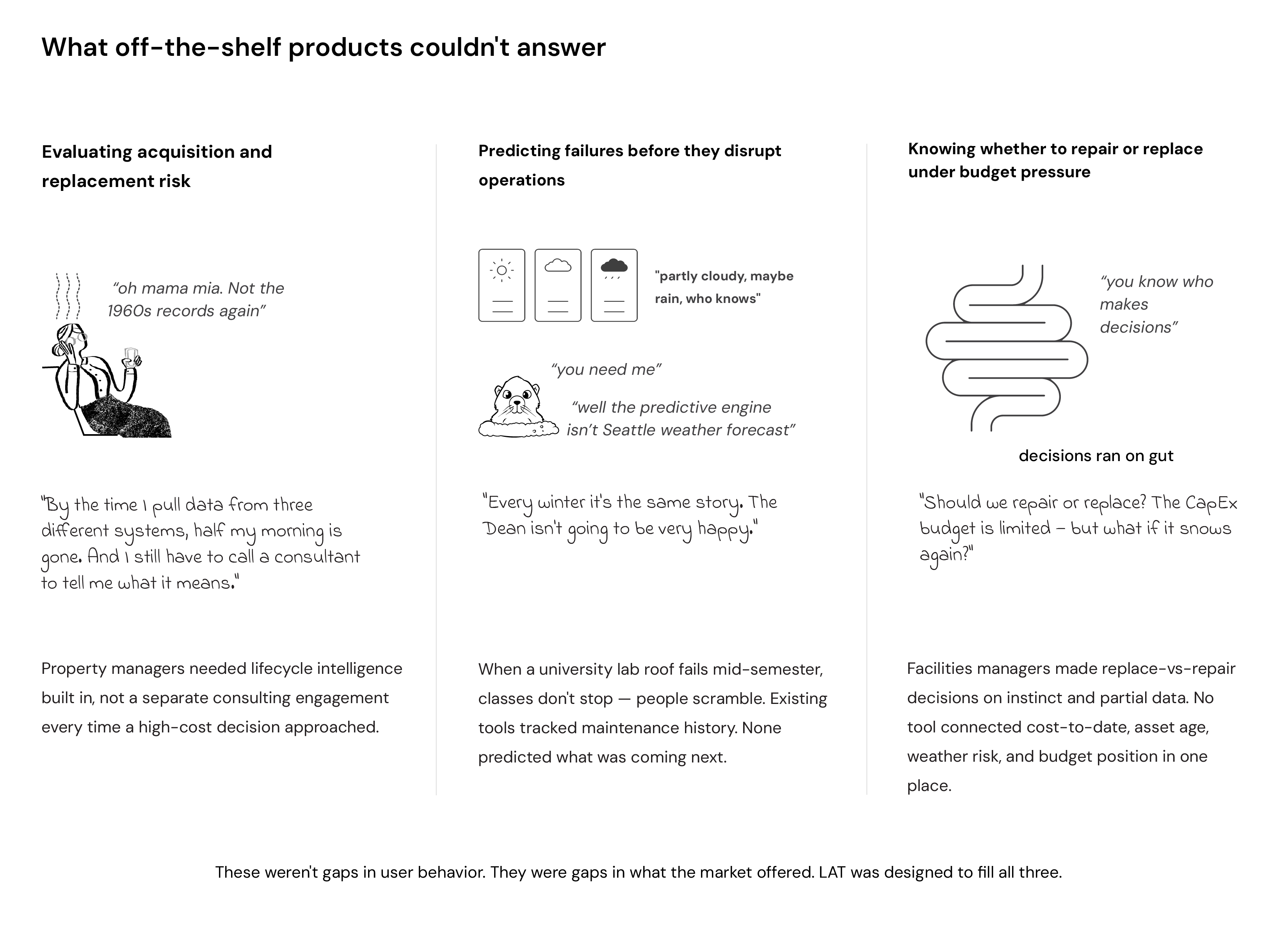
Market Gap Analysis

03 — The Turning Point

Research revealed we were redesigning a system of coordination

We thought we were customizing a product. Research showed we were redesigning a system of coordination.

The breakthrough wasn't the AI — it was recognizing that fragmented data was forcing humans to do system work. Everyone had access to data; what they lacked was context, prioritization, and trust.

That reframed everything. Instead of one dashboard for everyone, we built role-based surfaces over a shared foundation, surfacing only what was actionable.
System architecture diagram — modular API layer, role-based surfaces, shared data foundation

04 — Solution

Three pillars turned operational signals into financial intelligence

Pillar 1 — Reliable Field Intelligence

Automatically link Work Orders ↔ Asset DNA ↔ Cost-to-Date. The conversation shifted from "we'll fix it again" to "this unit cost $42K in three years; replacing now saves $18K."

IMAGE 1: Field Workflow Evolution
Mobile interface showing: offline queue → capture with voice input → auto-sync confirmation
Annotation: "Reporting time: 20min → 8min"
The "Everything Dashboard" Failed

Multiple graphs looked impressive; managers scanned without acting. We replaced it with a ranked priority queue — action first, analysis second.

IMAGE 2: Dashboard Before/After
Left: Dense "Everything Dashboard" with 8+ graphs
Right: Clean priority queue with contextual side panels
Annotation: "Decision time: 14min → 4min"
Pillar 2 — Predictive Lifecycle Intelligence

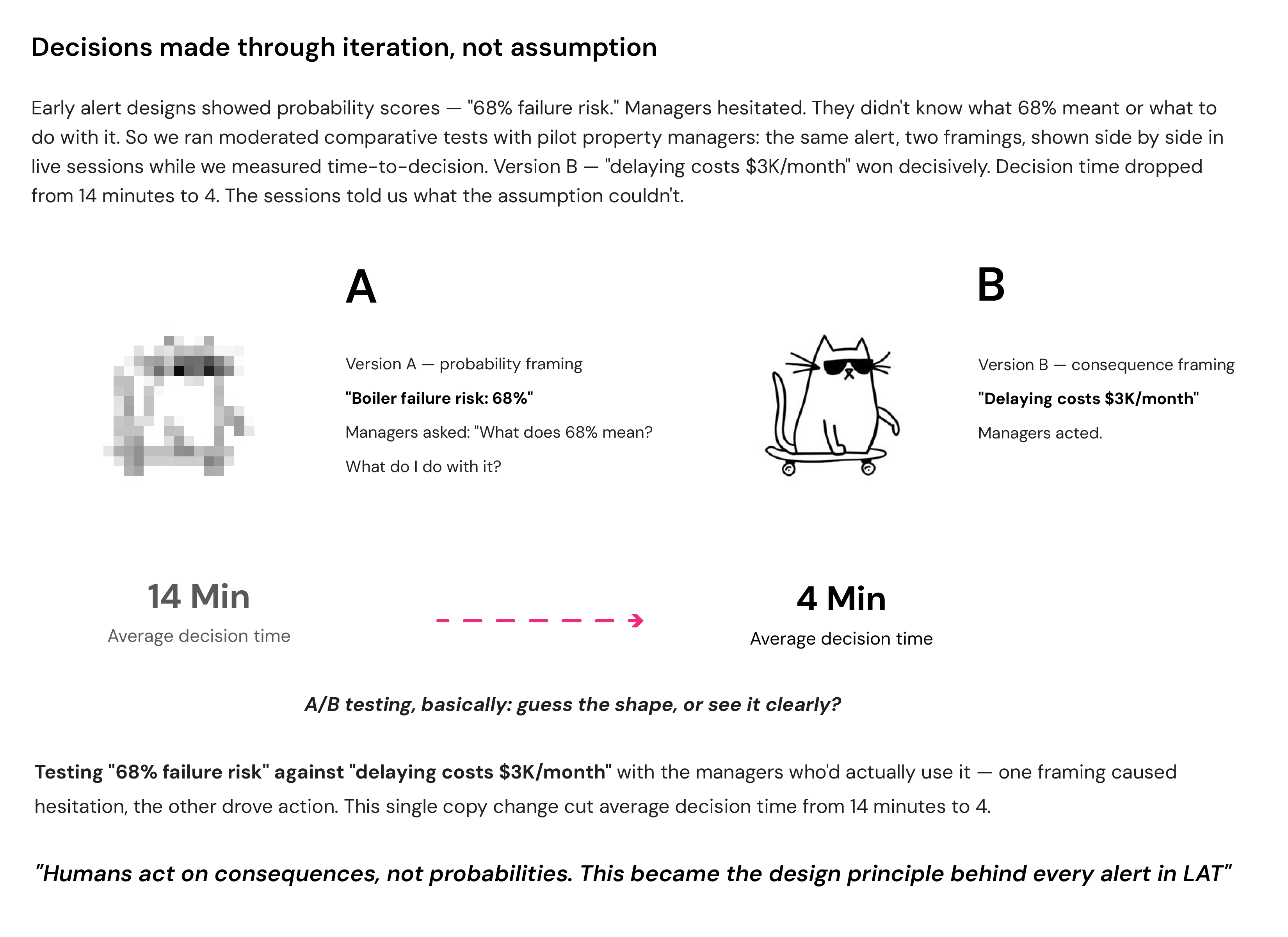
Turn predictive signals into ranked alerts. Early alerts said "Boiler failure risk: 68%" — managers hesitated. We shifted to consequence framing: "High vibration + 9 years in service → delaying replacement may cost $18K." Humans act on consequences, not probabilities.

IMAGE 3: Alert Card Before/After ⭐
Left: "Boiler failure risk: 68%" (probability framing)
Right: "High vibration + 9yr service → $18K savings if replaced now" (consequence framing)
Shows: Critical/Monitor/Safe tiers + top 3 drivers
The Boiler Incident — When AI Was Wrong

Month 2: the engine flagged a $180K boiler replacement as Critical. Inspection showed duplicated repair entries had inflated the risk. Three guardrails contained it — manager review gate, visible drivers, no auto-procurement. We added a "Needs Verification" state and multi-signal validation. Adoption held at 95%.

The real AI risk in enterprise isn't model sophistication — it's dirty upstream data influencing downstream capital decisions.
IMAGE 4: Boiler Incident Screen
Critical alert showing visible contributing drivers (with duplicate entries highlighted)
"Needs Verification" state badge
Manager override logged in timeline
Pillar 3 — Strategic Simulation & Governance

In-house scenario comparison with side-by-side cost/timeline deltas. Before LAT, feasibility questions meant commissioning external studies; after, teams ran three scenarios instantly and exported board-ready outputs. Decision velocity over spectacle.

IMAGE 5: Scenario Comparison
Two scenarios side-by-side: "Repair" vs "Replace"
Shows: Cost delta, timeline delta, risk comparison
Export button for board-ready CapEx reports
📸 Image / Video / Figma Embed
Replace with: <img>, <video>, or <iframe> for Figma prototypes
Section: 04 — Solution

05 — Constraints & Design Responses

The legacy ecosystem couldn't be disrupted, so LAT shipped as a modular layer alongside it

Legacy Ecosystem Couldn't Be Disrupted
LAT shipped as a modular API layer alongside the existing CMMS/ERP stack — no forced migration, no workflow replacement, incremental transparency without triggering resistance.
Data Integrity Had Hard Boundaries
Strict governance meant we inherited duplicated, inconsistent records. That constraint produced the project's defining incident (section 04); the response — validation states, multi-signal checks, confidence tiers — became the product's trust architecture.
Capital Decisions Were Political
Layered approvals, public accountability, donor influence — automation there isn't neutral, it's political.
IMAGE: Approval Workflow
Manager review gates → AI reasoning display → Override logging
Shows human-in-the-loop design
Roles Had Wildly Different Needs
Technicians needed voice-to-text and big touch targets, not desk-built forms. Managers running 15 jobs a day needed delegation, not dashboards. Accountants needed brief-with-drill-down; executives needed two options, not a back-study. Role-based surfaces beat one universal view.
Field Reality: Connectivity & Devices
Technicians worked underground and on swing stages with unstable connections. We shipped offline-first capture with queued auto-sync, and pushed phone-first refinement to a later phase — field users wanted it sooner, but organizational trust had to come first.
Twelve Months Forced Scope Discipline
AI auto-scheduling, ESG modeling, digital twins, a live campus map — all tempting. The filter: one north star (reduce unexpected costs) plus two drivers (planning accuracy, adoption velocity). Anything that didn't serve those moved to the roadmap: data unification → offline workflows → lifecycle visibility → predictive modeling → simulation.
IMAGE: Offline-First Architecture
Mobile workflow: Local queue → Capture → Auto-sync → Retry logic
Shows connectivity resilience design

06 — Strategy

One north star: reduce unexpected maintenance costs by 25%

Every feature mapped to one of three drivers: cost reduction, planning accuracy, or adoption velocity. If it didn't serve one, it didn't ship.

Adoption Before Expansion
Offline workflows and repair clarity first; AI auto-scheduling and ESG modules second.
Data Integrity Before AI
Stabilized data foundation first, predictive sophistication second.
Reduce Cognitive Load
Role-tailored surfaces, signals not noise.
Platform Thinking
The predictive engine improves as override data accumulates: more campuses → more lifecycle data → smarter predictions → higher switching cost. LAT compounds intelligence through use.

07 — Tradeoffs

We chose human-in-the-loop over speed, accepting slower decisions to build trust
Automation vs. Trust
The engine could have auto-escalated and auto-scheduled maintenance. We chose human-in-the-loop instead — 95% adoption, with override frequency falling over time. Early automation would have collapsed adoption after the first visible mistake.
61% → 19% override rate, month 1 to month 7 — trust earned incrementally, not assumed
Signal Richness vs. Decision Speed
Engineering wanted 10+ predictive inputs visible per asset. Testing showed users focused on risk, time-to-impact, and cost — everything else created hesitation. We showed top drivers and moved depth to drill-down.
Transparency vs. Organizational Comfort
Some stakeholders wanted curated weekly summaries; real-time visibility exposed inefficiencies and shifted narrative control. I pushed for role-based dashboards with threshold notifications — meetings became strategic, not status-driven.
What "Minimal Disruption" Actually Meant
UW issued an RFP after evaluating vendors, and the Director of Facilities was the executive sponsor who signed off. But the bar for "yes" wasn't set by one person — it was collectively defined by the PMs, accountants, and executives who'd have to live with the system: limited spend, minimal disruption, and integration with the existing CMMS/ERP rather than a replacement. I initially read "minimal disruption" as designing within their existing tools. Research showed the real ask was reorganizing how five different roles worked day-to-day — the interfaces were a symptom, not the problem. Getting five stakeholder groups who didn't report to me, and didn't agree with each other, to accept that reframe was the actual sell.
One Dashboard vs. Role-Based Views
The first design was a single dashboard for every user, matching the stakeholder assumption that one shared view would fix coordination. It didn't — testing showed it stalled decisions and confused technicians, managers, and executives alike, each scanning for something different. I moved to role-based surfaces over one data model instead, which meant re-litigating the original decision with the same executives who'd approved it.
AI Expansion vs. Data Integrity
There was momentum to widen predictive coverage fast after early results. We slowed it — validation states, inventory checks, override logging first. Data accuracy: 70% → 95%.
AB Testing comparison showing simplified vs detailed alert views
The failure mode is never the UI. It's adoption, trust, and behavior — once those break, the metrics follow.
IMAGE: Trust Over Time Chart
Override rate: 61% → 19% | Decision time: 14min → 4min | Adoption: climbing to 95%
Interventions marked: Boiler incident (Mo 2), Confidence tiers (Mo 3), Consequence framing (Mo 5), Feedback loop (Mo 7)

08 — Impact

The biggest change wasn't cost savings — it was decision confidence

Operational. Linking work orders to lifecycle cost made repair history visible in real time — managers began reviewing repair frequency before approving repeat fixes.

Decision-making. Teams stopped entering meetings to reconcile facts and started entering them to decide.

Strategic. Scenario simulation moved feasibility analysis in-house and drew expansion interest from other universities — a path from consulting project to scalable platform.

The biggest change wasn't cost savings. It was decision confidence.

09 — Reflection

Clarity drove action more than completeness — users didn't want more data, they wanted less to think about

What I got wrong. I thought predictive accuracy would drive adoption — it didn't. Data integrity and clarity mattered more; strong predictions failed when the underlying data was messy or hard to act on. Next time: audit data before any predictive expansion, and lead with consequence framing from day one.

What mattered more than expected. The lifecycle linkage, not the AI. Once work orders, asset history, and cost-over-time were reliably connected, decisions improved before the predictive layer even matured — users didn't want more data, they wanted less to think about.

What I learned about AI in enterprise. Adoption depends less on model sophistication than on trust architecture — visible reasoning, human control, confidence-aware outputs, failure containment built in from the start. One wrong high-visibility alert can undo months of adoption. Design for the failure, not the demo.

Next Case Study
Misinformation Center
Media Literacy Tools
EmailLinkedIn ↗Resume ↗