Keye
Subscription Marketplace — From three static screens to a YC-backed company
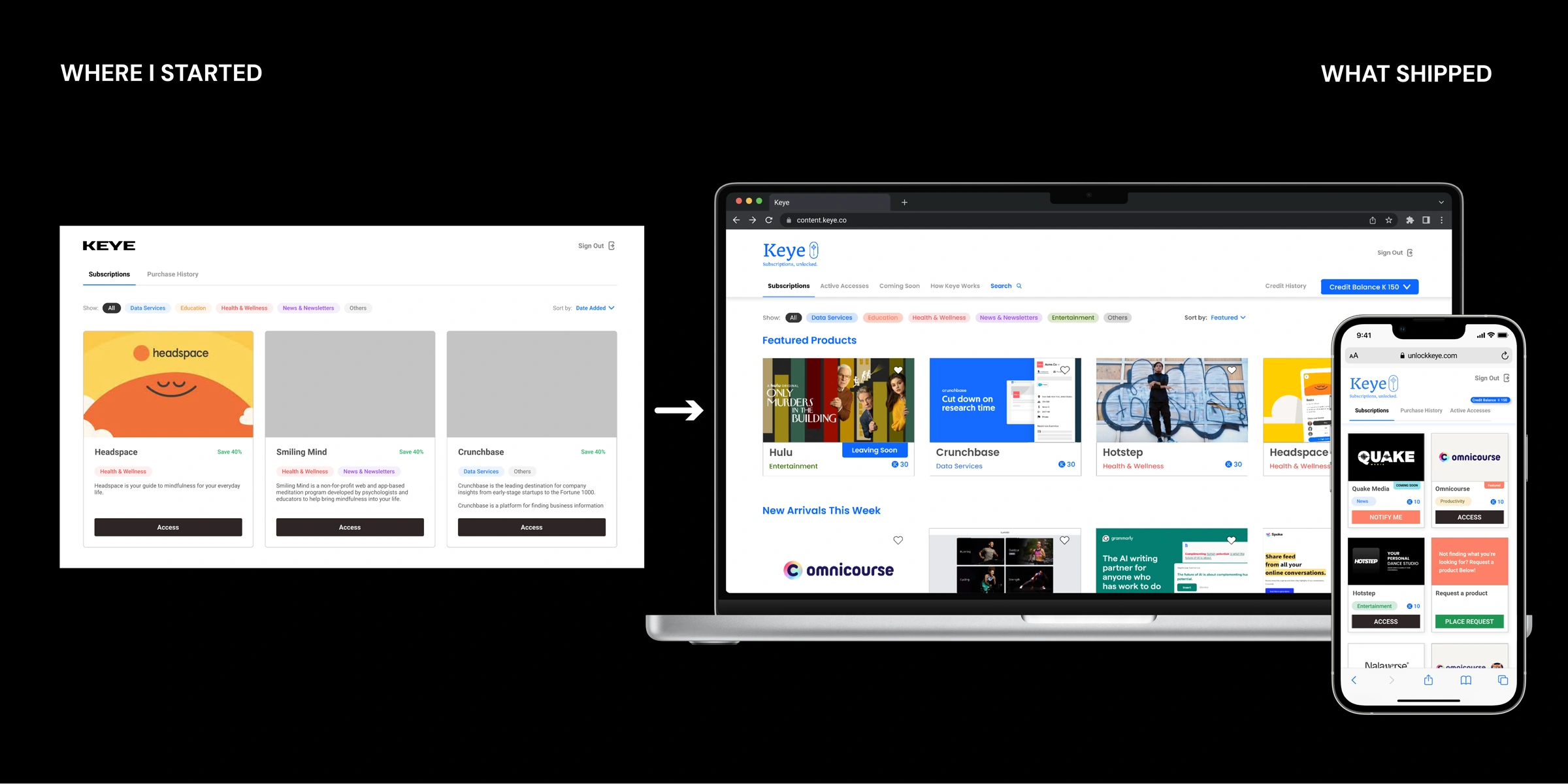
TL;DR
01 — Snapshot
Product
A credit-based marketplace for flexible access to premium tools — Grammarly, Adobe, Otter.ai, MasterClass, Crunchbase, and 150+ others — without long-term subscriptions. ClassPass for digital tools.
My role. Founding (and for most of Keye's life, only) designer. Founders set product vision and fundraising strategy; the PM and I turned it into what shipped. I designed every surface — web, mobile web, Chrome extension — wrote PRDs, ran research, and hired the two designers who replaced me.
Timeline. 2 years (2021–2022): beta to credit system to marketplace to extension to seed funding. After the founding team dispersed, the company pivoted into YC W2024 on the traction we built.
Impact
02 — The Problem
Premium tools were priced for committed subscribers, not curious explorers
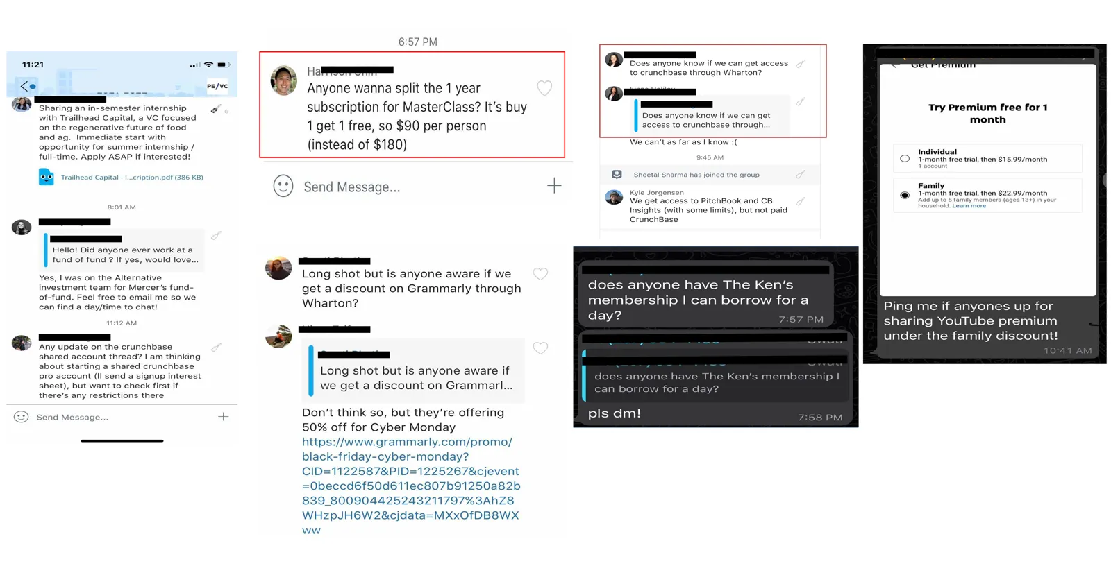
Users created fake emails for free trials, shared passwords in friend groups, even paid for a VPN to unlock cheaper regional pricing. Premium tools like Grammarly ($180/year) and Crunchbase ($600) were priced for committed subscribers, not curious explorers.
"I keep creating new email accounts to get free trials. It's the only way to try things without committing."
ClassPass proved flexible multi-provider access worked; Apple One bundled someone else's services. Neither filled the gap between free trial and full subscription — that gap was Keye's opportunity.
03 — Where I Started: Evidence over Instinct
My job wasn't to execute the founders' instincts but to introduce user evidence into a team moving on momentum
My first task was the purchase flow. Founders had baked in mandatory consent and a feedback survey at checkout — completion dropped 30% there. I moved consent to signup and tested the survey in three placements: email (80% ignored), in-checkout (confused buyers), and a post-access popup, which worked because users had just used the product. Drop-off fell 20% in one sprint.
The hardest call was removing product descriptions after testing showed users scanning, not reading. I led with imagery and a side-by-side price comparison, pre-selecting Keye — some users then bought full subscriptions through us, a behavior we hadn't designed for but kept.
04 — Features
Three systems that carried the rest of the product
The Credit System
Designed with the founders and PM, proven by users — five pricing models in ten months
Credit counter animating ∞ → 200 → tier badges
Founders needed monetization before runway ran out — that direction was theirs. What shipped was five real pricing models in ten months, each one killed by evidence the PM and I brought back from users, not opinion.
The Product Card
Shaped as much by engineering's constraint as by design intent
system → states → scale → support → growth → mobile
Six versions, because every other system eventually had to live inside this one card — from an inherited layout with no system to a mobile design system reused for the Chrome extension. Engineering kept asking one question: can this be a state of the existing component, not a new one? That constraint, not a personal design philosophy, is what kept the card reducing instead of sprawling.
The Chrome Extension
A constraint the team couldn't engineer around — until the idea came from buying a rain jacket
Annotate step count to make −63% concrete
Partner integrations were the founders' original plan — the roadmap called for each partner to build against our API. Then our technical co-founder left, taking backend capacity with him, and that plan stopped being possible. Watching Honey auto-fill codes at checkout, I saw a fix that needed no partner engineering at all — the breakthrough was recognizing we should live where the user already is. Prototyped in two days, shipped that week with the remaining team.
05 — Tradeoffs & Hard Calls
None of these were mine to decide alone — engineering, marketing, founders, and investors each pushed back, and the product was better for it
Every hard call below was negotiated, not dictated — my job was bringing evidence into rooms where other people had the final say.
06 — Impact & Reflection
The most important thing a founding designer builds isn't the product. It's the foundation that lets the product grow without being rebuilt from scratch
By year three, the founding team dispersed. The company pivoted into YC W2024 on financial analytics — the marketplace didn't survive, but the research, partnerships, and funding that made YC possible came from what we built.
Keye compressed the feedback loop between decision and consequence from months to days. It taught me to treat every decision as a hypothesis — the ones I confirmed without testing were the ones that broke in production.